EverCare: Elderly Care App

My role
UI Designer
Timeline
50 hours
Brief
The topic was to design an app for elderly care. The challenge was to come up with a concept and design the wireframes within 50 hours.
Approach
After conducting a quick competitive audit, I made a note of the missing features and pain points that are not recognised. I brainstormed on solutions and quickly finalised on the features that need to be included.
Key Findings
Most users rely on manual reminders or emails to track renewals.
Several reported missing payments even after receiving app notifications.
A growing number subscribe to free newsletters and waitlists, which clutter inboxes and go unnoticed.
Users want a single place to see all active subscriptions, their costs, and renewal dates.
63% said they share at least one subscription with a friend or family member but find managing payments confusing.
Drafting the problem statement
💡
To build a community for the elderly which helps in curing loneliness, helping with loss of purpose and boost activity among them.
Low Fidelity Screens


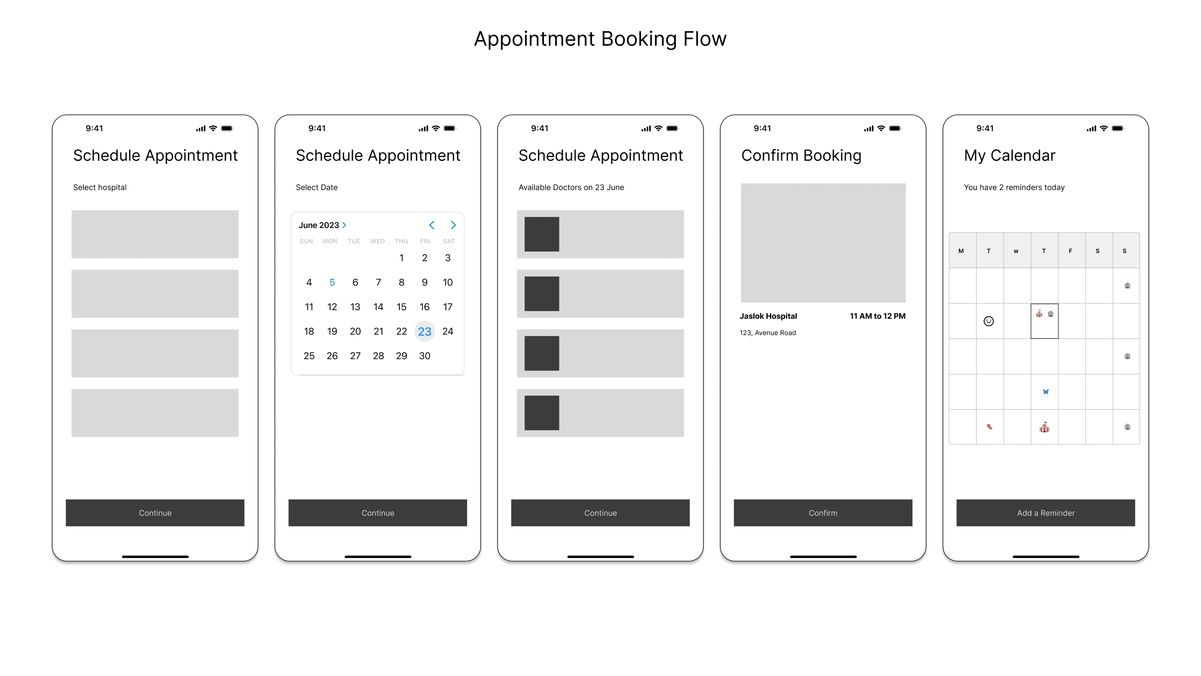

High Fidelity Wireframes


If I had time, what would I have done differently?
Research
I would have done secondary research to understand the scenario better.
I would have done contextual inquiries to understand actual usage flow and identify patterns in behaviour.
Design
The touch targets are small for the intended audience. I would make changes to the design with respect to guidelines for senior citizen.
I would have chosen a colour palette backed by research which is suitable for older audience. (not to forget the contrast ratio which is so less in this)
